


Introduction to Seasonal Color Pairing
Seasonal color pairing is a concept that involves aligning color choices with the distinct characteristics and moods of each season. This approach is widely embraced in various creative fields, including fashion, interior design, and even marketing. By understanding and applying seasonal color pairing, one can enhance the visual appeal and emotional resonance of their work, ensuring it aligns with the natural cycles and human psychology.
Each season carries its unique palette of colors that often reflect the environmental changes and cultural associations tied to that time of year. For instance, spring is typically associated with soft pastels and fresh, vibrant hues that signify renewal and growth. Summer brings in more vivid and bright colors that evoke warmth and energy. Autumn is characterized by rich, earthy tones like deep oranges, browns, and muted greens, reminiscent of falling leaves and harvests. Winter, on the other hand, often features cool, crisp colors such as icy blues, silvers, and deep reds, evoking a sense of calm and festivity.
The importance of seasonal color pairing extends beyond aesthetic appeal. In fashion, it helps designers create collections that feel timely and relevant, resonating with the consumer’s current mood and environment. In interior design, it can transform a living space to reflect the changing seasons, enhancing comfort and ambiance. For marketers, aligning color schemes with seasonal themes can make advertising campaigns more effective by tapping into seasonal emotions and trends.
By mastering the art of seasonal color pairing, individuals and professionals can ensure their projects are not only visually cohesive but also emotionally engaging. This concept encourages a dynamic approach to color usage, promoting creativity and versatility. As we delve deeper into this guide, we will explore specific color palettes for each season, practical tips for implementation, and expert insights to help you become proficient in seasonal color pairing.
Spring Color Palette
As the chill of winter gives way to the warmth of spring, the world around us bursts into a vibrant array of colors. The spring color palette is characterized by its fresh, lively hues that reflect the season’s rejuvenating spirit. Pastels, greens, and bright colors dominate this palette, bringing an air of freshness and new beginnings.
Pastels are quintessentially spring. These soft, muted colors include shades like lavender, blush pink, baby blue, and mint green. They are perfect for creating a serene and calming atmosphere, whether in your wardrobe or home decor. A pastel pink dress paired with a mint green cardigan, for instance, can make a chic and delicate outfit. Similarly, incorporating pastel-colored cushions and throws into your living space can instantly uplift the ambiance, making it both cozy and stylish.
Green is another standout color for spring, symbolizing growth and renewal. From earthy tones like sage and olive to more vibrant shades like lime and emerald, green offers a versatile range for seasonal pairing. In clothing, a sage green top can be paired with white trousers for a crisp, fresh look. For home decor, adding potted plants or green accent pieces can bring a touch of nature indoors, enhancing the overall aesthetic.
Bright hues are the bold counterparts in the spring palette, adding energy and excitement. Colors like sunny yellow, coral, and turquoise can make a striking statement when used thoughtfully. A coral blouse, for example, can be a standout piece when paired with neutral bottoms. In home decor, a turquoise vase or a set of bright yellow cushions can serve as eye-catching focal points, enlivening the space.
Effective color pairing in spring revolves around balance and harmony. Combining pastels with brighter shades can create a dynamic yet cohesive look. For instance, a blush pink skirt with a coral top can make for a vibrant yet soft outfit. Similarly, in home decor, mixing pastel and bright accessories can create a balanced and visually appealing space.
Summer Color Palette
Summer is synonymous with vibrancy and energy, making it the perfect season to experiment with bold and lively colors. The summer color palette is dominated by bright yellows, captivating blues, and an array of tropical shades that evoke the warmth and excitement of the sunniest months. Incorporating these colors into your wardrobe and living spaces can transform your environment, bringing a refreshing and dynamic ambiance that mirrors the essence of summer.
One of the quintessential summer colors is bright yellow. This hue effortlessly captures the spirit of the season, radiating warmth and positivity. Whether it’s a sunflower-yellow sundress or accent pillows in your living room, yellow can instantly uplift your mood and add a cheerful touch to any setting. To avoid overwhelming your space or outfit, consider pairing yellow with neutral tones like white or beige, which provide a balanced and sophisticated look.
Blues, ranging from soft sky blue to deep navy, are another staple of the summer color palette. These shades bring a sense of calm and tranquility reminiscent of clear summer skies and serene ocean waves. Incorporating blue into your wardrobe can be as simple as opting for a light blue linen shirt or a pair of navy shorts. In your living spaces, blue accents such as curtains, rugs, or even artwork can create a cool and inviting atmosphere, perfect for hot summer days.
Tropical shades like coral, turquoise, and lime green add an exotic flair to the summer palette. These vibrant colors can be seamlessly integrated into your wardrobe through statement pieces like a coral maxi dress or turquoise accessories. In your home, tropical hues can be introduced through decorative elements such as throw blankets, vases, and wall art. These colors not only brighten up the space but also evoke a sense of adventure and relaxation, reminiscent of tropical getaways.
By thoughtfully incorporating these bold and lively colors into your wardrobe and living spaces, you can fully embrace the essence of summer. The key is to find a balance that reflects your personal style while capturing the season’s vibrant and dynamic spirit.
Autumn Color Palette
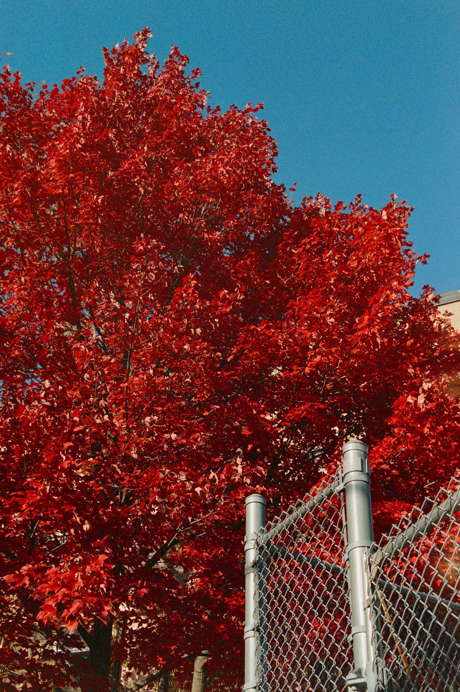
The autumn season brings with it a rich tapestry of colors that evoke warmth and comfort. The autumn color palette is characterized by deep reds, vibrant oranges, earthy browns, and mustard yellows. These hues not only reflect the natural changes occurring in the environment but also possess the ability to transform interior spaces into cozy sanctuaries.
Deep reds, reminiscent of falling maple leaves, can be used to introduce a sense of drama and elegance into a room. This color works particularly well as an accent wall or in decorative items such as throw pillows and rugs. Pairing deep reds with lighter neutrals like beige or cream can balance the intensity, creating a harmonious and inviting atmosphere.
Oranges, ranging from burnt sienna to pumpkin spice, are quintessential autumn colors. These shades exude warmth and can be used in various ways to enhance the seasonal ambiance. Consider using orange in statement pieces like an armchair or a sofa. For a subtler approach, incorporate it through accessories such as vases, candles, or artwork. Combining orange with natural materials like wood or rattan further emphasizes the cozy aesthetic.
Browns are the backbone of the autumn palette, offering a grounding effect that complements the more vibrant colors. From chocolate brown to tan, these shades provide a versatile base that can be seamlessly integrated into any design scheme. Brown furniture pieces, such as wooden tables or leather chairs, add a rustic charm, while brown textiles like blankets and curtains contribute to the layers of warmth.
Mustard yellows are the final touch to the autumn color palette. This shade brings a pop of color without overwhelming the space. Mustard yellow can be incorporated through smaller items like cushions, lampshades, or even kitchenware. Its versatility allows it to pair well with both the darker and lighter elements of the autumn palette.
By thoughtfully integrating these autumnal hues into your home decor, you can create an environment that feels both inviting and reflective of the season’s inherent beauty. Whether through bold statements or subtle accents, these colors capture the essence of autumn and bring it indoors.
Winter Color Palette
Winter colors exude a cool and crisp aesthetic, often characterized by shades of white, blue, silver, and deep jewel tones. These hues evoke the serene and festive spirit of the season, making them ideal for various applications in both fashion and home decor. Understanding how to effectively use these colors can transform your wardrobe and living spaces, creating a cohesive and stylish winter look.
In fashion, winter colors can be effortlessly incorporated into your wardrobe to reflect the season’s ambiance. White, for instance, can be used as a base layer, providing a fresh and clean look that mirrors the snowy landscape. Pairing white with silver accessories can add a touch of elegance and sophistication. Deep jewel tones such as emerald green, ruby red, and sapphire blue can be introduced through statement pieces like coats, scarves, or handbags. These rich colors not only stand out against the typically muted winter backdrop but also add warmth and depth to your ensemble.
Blue, in its various shades, is another quintessential winter color. Light blue can evoke the icy, serene atmosphere of a winter morning, while navy blue provides a more grounded and classic feel. Combining different shades of blue can create a harmonious and visually appealing outfit. Additionally, incorporating metallic elements like silver and gold can add a festive touch, perfect for holiday gatherings and celebrations.
When it comes to home decor, the winter color palette can transform your living space into a cozy and inviting retreat. White and silver can be used to create a minimalist and modern look, ideal for those who prefer a clean and uncluttered environment. Adding deep jewel tones through throw pillows, blankets, or curtains can introduce a pop of color and warmth. These colors work well together, creating a balanced and stylish interior that reflects the beauty of winter.
Overall, mastering the winter color palette involves understanding how to combine these cool, crisp shades to evoke the season’s unique charm. Whether in fashion or home decor, these colors can help you create a serene and festive atmosphere that celebrates the essence of winter.
Transitional Colors and How to Use Them
Transitional colors are integral to creating a wardrobe or design palette that can effortlessly adapt to the changing seasons. These versatile shades, which include neutrals and other adaptable hues, offer a seamless way to maintain a cohesive aesthetic all year round. By incorporating these colors into your wardrobe or interior design, you can ensure that your overall look remains harmonious, regardless of the season.
Neutrals such as beige, gray, and white are quintessential examples of transitional colors. These shades provide a stable foundation that complements a wide array of other colors, making them indispensable in any season. For instance, a beige trench coat can be paired with a light dress in spring, layered over a sweater in fall, or worn with a scarf and gloves in winter. Similarly, a gray sofa in your living room can be accented with pastel pillows in spring and summer, and swapped out for richer, darker hues in fall and winter.
Moreover, versatile shades like navy blue, olive green, and burgundy can also serve as effective transitional colors. These hues are rich yet neutral enough to blend seamlessly with seasonal variations. Navy blue, for example, can be lightened with white and soft pinks in the warmer months, while pairing perfectly with deeper tones like maroon and mustard during the colder seasons. Olive green has a similar adaptability, offering a natural, earthy tone that works well with both bright summer colors and the muted shades of autumn.
Maintaining a cohesive look as you transition from one season to the next involves thoughtful layering and strategic color pairings. When planning your wardrobe or interior design, aim to mix and match these transitional colors with more seasonal hues. This approach will not only provide visual consistency but also allow for greater flexibility and creativity. By mastering the use of transitional colors, you can navigate the changing seasons with style and ease.
Tips for Personalizing Your Seasonal Color Palette
Personalizing your seasonal color palette is a nuanced yet rewarding endeavor. To start, consider your individual style, skin tone, and personal preferences. Each of these elements plays a significant role in making your seasonal color palette truly unique and reflective of your personality.
First, assess your skin tone, as it serves as the foundation for choosing the right color combinations. People with warm skin tones—characterized by yellow or golden undertones—tend to look best in earthy colors such as olive, mustard, and terracotta. Conversely, cool skin tones, which have pink or blue undertones, harmonize well with jewel tones like emerald green, sapphire blue, and amethyst purple. For those with neutral skin tones, a balanced mix of both warm and cool colors can create a versatile and cohesive palette.
Next, reflect on your personal style. Are you drawn to classic, minimalist looks, or do you prefer bold, eclectic choices? If you lean towards a classic aesthetic, consider using timeless colors like navy, white, and black as your base, adding seasonal touches with accessories or accent pieces. For a more eclectic style, don’t be afraid to experiment with unconventional color pairings and patterns that resonate with your creative spirit.
Practicality also plays a part in personalizing your seasonal color palette. Evaluate your wardrobe and identify staple pieces that you wear frequently. Incorporate complementary colors that can be mixed and matched with these staples to maximize versatility. For example, if you have a favorite navy blazer, integrating colors like coral or mint can add a fresh, seasonal twist while keeping your look cohesive.
Finally, take inspiration from your environment and experiences. Seasonal changes in nature, travel destinations, and even cultural events can provide a rich source of color ideas. By blending these influences with your personal preferences, you can create a seasonal color palette that is not only visually appealing but also deeply meaningful.
Conclusion and Final Thoughts
In this comprehensive guide, we’ve explored the intricacies of mastering seasonal color pairing, emphasizing its significance in enhancing both personal style and overall aesthetic appeal. By understanding the unique characteristics of each season’s color palette, individuals can make informed decisions that resonate with the prevailing mood and natural environment. From the vibrant and bold hues of summer to the muted and earthy tones of autumn, each season offers a distinct set of colors that can be harmoniously paired to create visually appealing and stylish combinations.
Seasonal color pairing is not just about following trends; it is about understanding the psychological and emotional impact of colors and how they can be used to express individuality. The thoughtful selection of colors can evoke feelings of warmth, freshness, calmness, or energy, depending on the desired effect. This guide has provided insights into the practical application of seasonal color pairing, highlighting key color combinations and offering tips on how to balance and contrast different shades effectively.
We encourage you to experiment with various palettes and discover what works best for your personal style and environment. Don’t be afraid to step out of your comfort zone and try new combinations that you might not have considered before. The beauty of seasonal color pairing lies in its versatility and the endless possibilities it offers for creativity and self-expression.
We would love to hear about your own experiences and ideas when it comes to seasonal color pairing. Feel free to share your thoughts and inspirations in the comments section below. Your contributions can inspire others and foster a community of individuals who appreciate the art of color coordination. Thank you for joining us on this journey through the world of seasonal color pairing, and we look forward to seeing the vibrant and unique combinations you create.
